Many Poker Copilot users wrote to me overnight about a problem: since the Full Tilt Poker update on Jan 11th, 2011, your place in the tournament is not shown IF you didn’t finish in the money.
Loyal Poker Copilot customer Nikita deduced the problem: the tournament summary files on Mac OS X are missing the last line when you didn’t finish in the money. This is the line that says what place the hero came.
If this affects you, can I ask you report it to Full Tilt Poker? I’ve reported it myself, but the more people who report it, the more likely it is that there will be a prompt fix.
UPDATE: A Full Tilt developer wrote to me: “Thank you for the report, we have reproduced this and will fix it in the next release.”
I don’t get it. The number of players on Merge Network at any given time is roughly 3% of the number of players on PokerStars. 3,000 players instead of 100,000. And yet I’ve been getting bombarded with requests for Merge Network support. Methinks there could be a campaign going on here… 🙂
The Merge Network has recently released a native Mac OS X client – and it is not too shabby at all.
The next Poker Copilot update adds initial Merge Network support, although currently it only works fully with Lock Poker, one of the Merge Network clients. Here is Lock Poker with the Poker Copilot HUD:
These are the things missing from Merge Network support in Poker Copilot:
the hand history files don’t indicate whether a table is 9-seat or 6-seat. Only heads-up tables can be separated in the statistics.
as far as I can tell, there are no tournament results available
I don’t have any Merge Network hand history files with antes yet so I haven’t yet added inclusion of antes
Do you have Merge Network hand history files to donate to my collection of test files? If so, you’ll help me find the remaining bugs in Poker Copilot’s Merge Network support.
It’s not family-friendly, he’s crude, and I feel sort of dirty just for posting this link, but boy does The Oatmeal make some good points here about how to make your shopping cart suck less.
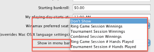
The “show my winnings in the menu bar” option in Poker Copilot has turned out to be popular. The next update improves this by letting you control what info is shown:
Please make the iTunes Store and the App Store respect my Mac OS X language settings. Yes, I reside in Germany and use a German credit card for online purchases. However my computer is set to English. That means I want my software to be in English, not in German. Every piece of software I use, be it Apple software or third party, is in English. Except the App Store and the iTunes Store.
I have a side interest in data visualisation. So I’m always keen to see innovative ways to present hard-to-visualise data. Hipmunk has done soooo many things right – and much better than the big companies in their field.
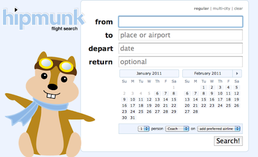
Let’s start with the hipmunk search form:
No need to manually select a “return” or “one-way” radio button or tab. Simply leave the return date empty for a one-way flight.
No need to click on a calendar pop-up icon – the calendar is always there, showing the current month and the next month – the two most likely months when you want to fly.
The defaults make sense – 1 person on coach on any airline is probably by far the most common search.
Click search and then hit the back button, and it actually works, bringing you back to the form the way you expect with web forms. Lots of similar sites manage to break the back button. Web users depend on the back button. Jakob Nielsen has long been telling us that “the Back button is the lifeline of the Web user and the second-most used navigation feature (after following hypertext links).”
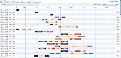
Now the search results:
Wow! That’s what I thought when I first saw this. Finally, a way to quickly assess the options. The beige colour represents stop-overs. Each airline gets its own colour so I can see, for example, that for $541 I can fly with Egyptair to Dubia (DXB), wait for about two hours, then continue with Emirates.
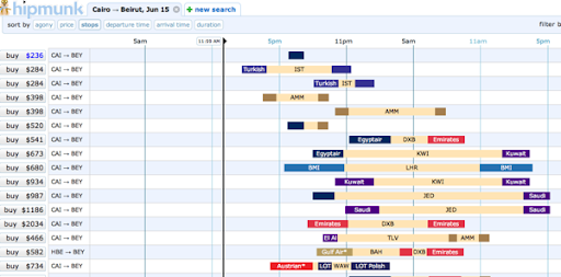
I don’t handle mornings well. Nor do I like stop-overs. So can I see this data prioritising direct flights that leave in the afternoon? You betcha – all the browser side, with no server refresh:
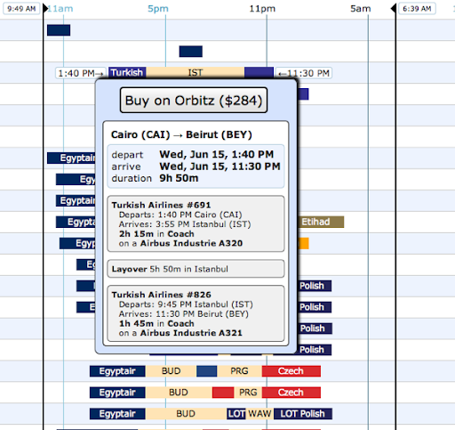
And it is all so easy. Click on any flight to see the details:
There’s a principle in web application user-interface design: if the end result seems far too simple for the amount of work you have put into it, then you have succeeded. Simple user interfaces are hard. Complicated user interfaces are simple. Hipmunk succeeded.