It took me a while playing around with mock-ups, but I’ve now got my poker app’s user interface just the way I want it. “Eating my own dogfood” helped.
While playing poker with my app running, I often check the latest raw values for “flops seen” and “take/100 hands”. It makes sense to make these values stand out. So I used a larger, bolder typeface and moved them to the top of the window.
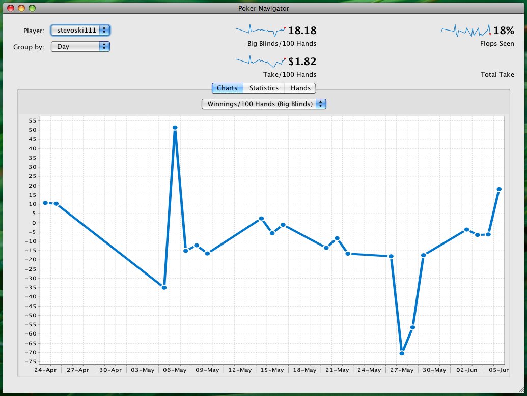
The rest of the screen was getting cluttered, something I’m trying earnestly to avoid. I don’t want new users getting overwhelmed by too much information. Therefore I’ve split the charts, tables and additional statistics between different tabs.
This is the not-quite-complete result:
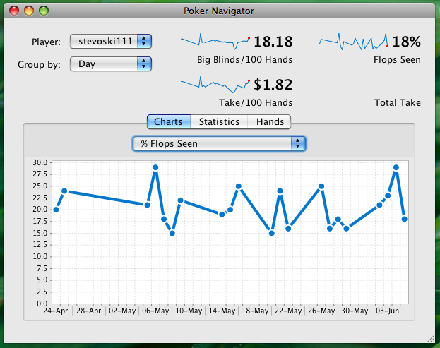
There’s another requirement that’s been guiding my progress. It must be practical to resize my poker app small enough so that two online poker tables and my app can be viewed simultaneously. I don’t want the user having to switch between windows constantly to monitor progress while playing.
Here’s the poker app reduced to roughly half the default size.
As you can see from the screenshot, the design still works at this size.
I’m writing from my favourite cafe in Cologne, Germany. As I walked in, the owner greeted me with a crisp German hello, as he always does. Then he started making my latte macchiato – without me even having to order. It’s the sort of local cafe where everyone knows the owner, the owner knows everyone, and half the customers know each other. There’s free wireless too, and a laser printer for the customers to use. For a bit of authentic Europe-ness, the street the cafe is on is a 2000-year-old road built by the Romans, although it has been modernised considerably since then. They’ve been digging up the road lately to create a new subway line, and they keep finding centuries-old artifacts and buildings underneath.
Now to sparklines. Sparklines are a nifty concept popularised by Edward Tufte. They are a way to show a number in context using very little space. Consider this statistic from my poker app:
Winnings/100 Hands: $1.82
Looks good, right? It’s a positive number, which means currently I am making money, instead of losing it the way I normally do.
But what if I normally win $5 per 100 hands? Then this number is bad. It indicates that either I am playing worse or my current opponents are better than usual. What we need is to see that number in context. Enter the sparkline. It’s a tiny graph reduced of all the usual graph paraphernalia. No labels, no title, no axes, simply a line showing the ups, downs, and tendencies.
Here’s the same statistic with a sparkline:
The “spark” in the word “sparkline” refers to the glowing red ember at the end. This is important, because it gives the user a visual clue that the value “$1.82” is the latest value. Without this red spark, the user might think the value is an average.
The sparkline in the example above shows me not only that I’m currently winning $1.82 per 100 hands. It also shows me that this is an improvement. It also shows me that I’ve have an ongoing tendency to improve my winnings per 100 hands. All this is shown in a small space.
I’m trying hard with my poker app to make the data easy-to-understand. Without care, I could easily overwhelm users with too much indecipherable information. Sparklines play an important role in achieving that.
Charts are important for my poker app. I’m using a nice open source Java charting library called JFreeChart. Well, sort of nice. It’s powerful and flexible but comes with no documentation. If you actually want to know how to use it, you have to pay 30 euros for the documentation and demos. However I found it was well worth paying the money. With the help of the docs, sample code, and forums, you can make JFreeChart do just about anything.
I use JFreeChart not only to create my poker app’s main charts, but also the sparklines. The sparklines were tricky, but with the helpful JFreeChart forums I soon had it sorted.
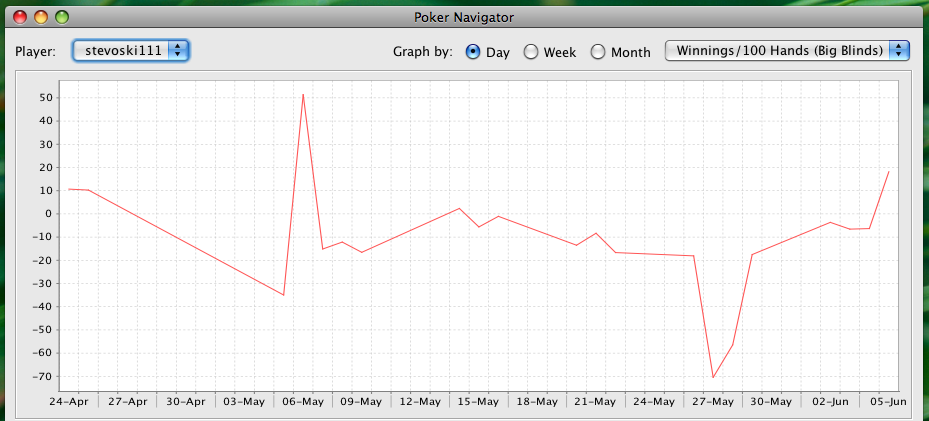
A great benefit of using JFreeChart is the ability to customise just about every aspect of a chart. Here’s what my line charts looked like before I customised the line renderer:
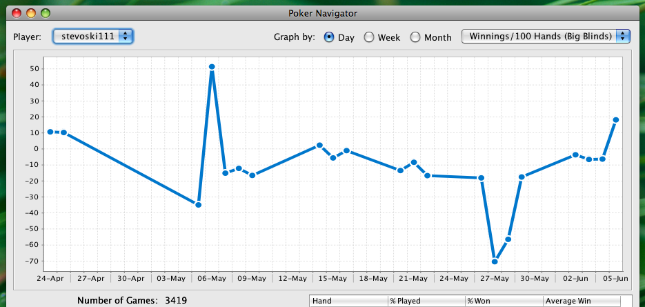
With a bit of inspiration from Google Analytics, here’s what my line charts look like now:
The customisation took about 10 lines of code. As ever, the difficulty lies in knowing what 10 lines of code to write.
When I tell poker players about my software, the first question is “does it import hand histories?” The sample space is small, but it seems like this is a must-have feature.
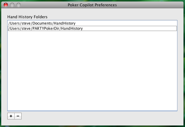
I have something better than “importing” in my poker app. The user can use the preferences to add additional folders to the hand history search path. All hand histories are read freshly every time the app is started. All recognised hand history files in any specified folder are loaded when my poker app starts. Additionally all these folders are polled for updates.
Are you a Java programmer? Have you used Swing? Then you’ll probably feel my pain. I almost always use a GUI builder but for my preferences dialog I needed to do it manually. Working with Swing Layout Managers often feels like a particularly nasty type of voodoo.
It’s because I wanted to use the little ‘+’ and ‘-‘ buttons normally used in OS X preference panels to add and remove things. Apple calls them “segmented gradient buttons”. Unfortunately it is tricky to get them just right. I eventually found the answer here: http://lists.apple.com/archives/java-dev/2008/May/msg00394.html
I’ve finally decided on my Poker app’s name. I bought the domain I’ll use. I won’t say what it is yet, because I want to get Google Analytics in place first.
Rumours are that my Poker app is called Poker Sidekick. Although I like this name, the owner of pokersidekick.com – a registered but unused domain – wanted too much money for it. Better to get a $10 domain instead. In the meantime I’ve been using the name “Poker Sidekick” as a holding place.
I had been thinking of calling my app “Poker Pilot”. Not only was the domain taken, there is also an app (not linked with the domain) called “Poker Pilot” which is definitely the work of scum and villainy. I’ve no desire to be associated with it.
I’ve been playing around with some major snazzing up of my user interface. I did this with Mac OS X’s Interface Builder. If I can get it looking pleasing enough, I’ll dedicate some time on the weekend to reworking the app’s GUI. This is the benefit of getting the parser and stats engine fully in place. Now I can redo the interface as much as I like, knowing that there is a solid app behind it.
But perhaps I should save the reworked interface for version 1.1. Or version 2. 🙂
I’m interested in seeing how Steve plans to promote something cleanly in an online field saturated with scum and villainy.”
That sounds foreboding and I’m grateful for it. It’s a reminder that promoting my app won’t be easy. I’m not quite sure what I will do yet, but what’s certain is that I won’t be joining the ranks of scum and villainy.
Thankfully there are also plenty of honest and reputable firms in the poker field. Outstanding people write poker books and articles. Websites give sensible playing advice. The major online poker firms themselves are on the level. There are quality products that my app will be competing with. I’m aiming to overcome their shortcomings, especially in ease-of-use.
I think my parsing is anything but slow. On my own MacBook Pro, the app parses at up to 4000 hands per second. On a multi-core computer it utilises all cores for parsing.
I improve the user’s perception of speed by parsing the newest data first. If the user has six months of hand history files, the most recent month will be parsed first, on the assumption that this is the data the user is most interested in.
Also for user perception, as each file is parsed, the GUI is updated so that the first graphs appear almost immediately upon startup.
This is part of my “100 nice touches” approach. These nice touches are the things that don’t make it on the feature list but make the product a joy to use. If all goes to plan, this “100 nice touches” approach will give me users who enthusiatically recommend my app.
Today I made my poker stats app automatically detect if Full Tilt Poker is installed. If so, it reads the location of the hand history files from Full Tilt Poker’s own preferences.
This was somewhat tricky. OS X Application Preferences are stored in a binary format. Although there exists a Java API to read an application’s own preferences, there seems to be no Java API to read other application’s preferences.
Luckily the Quaqua Look & Feel open source library has a class to help with this. It took some tinkering but the results are good. Now there is a good chance that first-time users will have no configuration to do. Immediately upon starting my poker app for the first time, their hand history files will be magically located and read, and attractive and meaningful graphs will appear in front of their eyes.
I was just doing some “testing” of my poker tracking app. In other words, slacking off and playing some online poker.
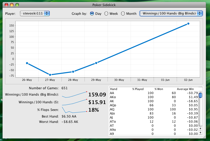
I noticed that my results for the last week are a very attractive curve. Unfortunately the obvious curve extrapolation is far from what will probably happen. 🙁