Day 8: The New Interface Revealed
It took me a while playing around with mock-ups, but I’ve now got my poker app’s user interface just the way I want it. “Eating my own dogfood” helped.
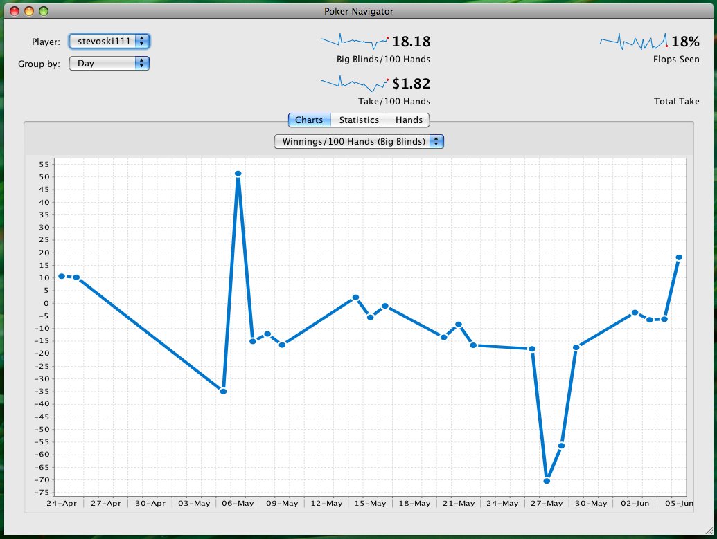
While playing poker with my app running, I often check the latest raw values for “flops seen” and “take/100 hands”. It makes sense to make these values stand out. So I used a larger, bolder typeface and moved them to the top of the window.
The rest of the screen was getting cluttered, something I’m trying earnestly to avoid. I don’t want new users getting overwhelmed by too much information. Therefore I’ve split the charts, tables and additional statistics between different tabs.
This is the not-quite-complete result:
There’s another requirement that’s been guiding my progress. It must be practical to resize my poker app small enough so that two online poker tables and my app can be viewed simultaneously. I don’t want the user having to switch between windows constantly to monitor progress while playing.
Here’s the poker app reduced to roughly half the default size.
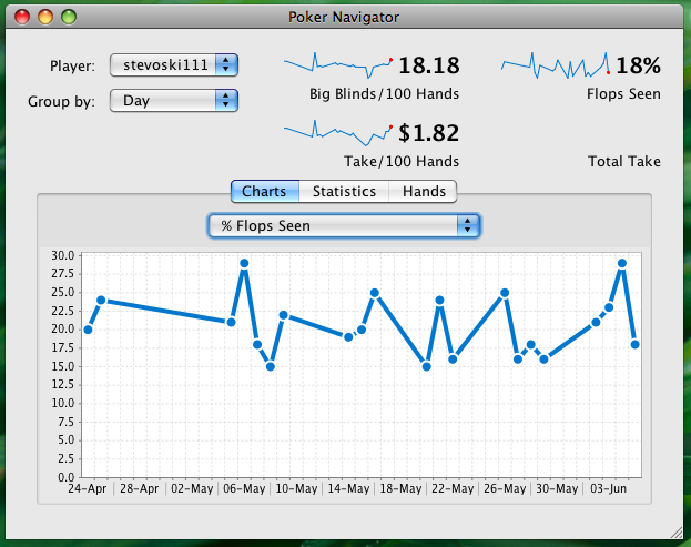
As you can see from the screenshot, the design still works at this size.