PokerStars Home Games
Many people have been reporting to me that the new PokerStars “Home Games” don’t have a Poker Copilot HUD. I hope to rectify this for the next Poker Copilot update.
Many people have been reporting to me that the new PokerStars “Home Games” don’t have a Poker Copilot HUD. I hope to rectify this for the next Poker Copilot update.
It seems the Full Tilt Poker (FTP) team made a small change to their Italian translation. The word “tavolo” (table) was changed to “Tavolo” (Table). This confused Poker Copilot’s “is this table a tournament?” logic. The result is that currently the Poker Copilot HUD (Head-up Display) doesn’t work for tournaments, if you use FTP in Italian.
The next Poker Copilot update will fix this.
[too long; didn’t read version: I’m experimenting with screen scraping to add a full HUD to Rush Poker. So far the experiment is going well. But it is tricky to get right so I’ll make “beta” Poker Copilot builds with this experimental Rush Poker support available soon.]
The current Rush Poker support in Poker Copilot is not great. As far as I know, no Mac OS X poker tracking software has good Rush Poker support. I spent much time over recent months mulling over what I could do to improve things.
The conclusion I came to over and over is that the best possibility is screen scraping the Rush Poker window to determine the player names. But I was fearful of this approach – for performance, accuracy, and maintainability reasons. Optical character recognition (OCR) – the art of a computer extracting text from an image – is notoriously unreliable. The ramifications of a player called phil_ivey being misread as phil_ive_no_idea – and therefore the wrong HUD stats being shown – could be very expensive.
My aim is 100% reliability. And fast at that.
Intractable problems become tractable when you add constraints. So I decided to see what I could achieve with the following constraints:
This gives me a known font to work with: Arial, 20 point. That, unfortunately is a problem. In Arial, lower-case L and upper-case i are rendered identically. Meaning that 100% success is impossible. However some tricks can make the success rate extremely close to 100% . More on that later.
Some analysis of the all the Full Tilt player names I have in my million+ hands of test data reveal the following:
That’s a total range of 65 characters.
I found this extremely useful pokerai.org forum thread on screen scraping. I read every post and made notes. Then I spent a day coding up a trial solution. Then I read through the forum again, this time understanding things better. Then I modified the solution.
I had a program that grabbed a screenshot once per second, extracted the parts of the images that contain the player names, and converted them to text with a success rate of about 70%. The problems were the l (small L)/I (big i) problem, and ligatures. I added some tweaks to handle ligatures and the success rate seems 100%, except l (small L)/I (big i).
It was a fun challenge. In the process I learnt about OCR techniques, computer typography, and re-learnt a rather rare computer data structure called Tries.
I’m going to keep working at this, trying for a more general solution that handles 6-max and 9-max tables at a range of window sizes and with different layouts. In the process I’ll make “beta” Poker Copilot builds available.
In Arial 20 point small L is indistinguishable from big i. You’ve probably sometimes misread a player’s name because of this. Here’s how I get around the problem:
If you are playing in the same session against “Al” (al) and “AI” (ai) this won’t work. But I’m going to accept this rare situation because I think the chances of this happening are exceedingly small. In the case that is does happen, no HUD will be shown. I think this is better than
Poker Copilot 2.78 is now available to download.
What’s changed:
What’s fixed:
Update Instructions:
Now you are done and ready to hit the tables.
Many Poker Copilot users wrote to me overnight about a problem: since the Full Tilt Poker update on Jan 11th, 2011, your place in the tournament is not shown IF you didn’t finish in the money.
Loyal Poker Copilot customer Nikita deduced the problem: the tournament summary files on Mac OS X are missing the last line when you didn’t finish in the money. This is the line that says what place the hero came.
If this affects you, can I ask you report it to Full Tilt Poker? I’ve reported it myself, but the more people who report it, the more likely it is that there will be a prompt fix.
UPDATE: A Full Tilt developer wrote to me: “Thank you for the report, we have reproduced this and will fix it in the next release.”
I don’t get it. The number of players on Merge Network at any given time is roughly 3% of the number of players on PokerStars. 3,000 players instead of 100,000. And yet I’ve been getting bombarded with requests for Merge Network support. Methinks there could be a campaign going on here… 🙂
The Merge Network has recently released a native Mac OS X client – and it is not too shabby at all.
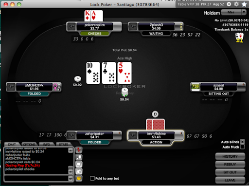
The next Poker Copilot update adds initial Merge Network support, although currently it only works fully with Lock Poker, one of the Merge Network clients. Here is Lock Poker with the Poker Copilot HUD:

These are the things missing from Merge Network support in Poker Copilot:
Do you have Merge Network hand history files to donate to my collection of test files? If so, you’ll help me find the remaining bugs in Poker Copilot’s Merge Network support.
Download a sneak preview of the next Poker Copilot update with Merge Network support here.
Danish reviewer, English review:
I wouldn’t think twice while saying that this is the best PokerTracker for mac if you are fan of the mac UI and intuitive workflow.
The next update will have an additional menu bar option. This is probably the most useful option: amount won AND hands played.
It looks like this when you are up:
and when you are down:
It’s not family-friendly, he’s crude, and I feel sort of dirty just for posting this link, but boy does The Oatmeal make some good points here about how to make your shopping cart suck less.
My suggestion: don’t even try to make your own online shopping cart. It’s hard, you know. Instead out-source it all to people whose livelihood depends on getting shopping carts right.
(Funny thing is, before the Internet, people where I come from didn’t even say “shopping cart”. It was supermarket trolley, I guess.)
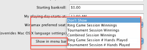
The “show my winnings in the menu bar” option in Poker Copilot has turned out to be popular. The next update improves this by letting you control what info is shown:
