A couple of days ago I uploaded a new version of the Poker Copilot home page. The new version has a enormous, bright, in-your-face download button that you can't ignore if you try.
I've heard that this completely unsubtle approach maximises downloads. The idea is that when people look for a product - let's say a poker hand history analysis tool for Mac OS X - you should make it as easy and tempting as possible to get the product on their computers. Did it work for me?
Let's take a look at a chart:
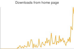
The spike at the end of the graph says it all. Spike is not even an adequate word here. It's a kangaroo leap to a new level.
I've not yet determined if there were side-effects, such as a drop in downloads from the download page or an increase in sales.
The Poker Copilot Blog
Tracking the development of Poker Copilot, Mac OS X software for poker analysis and statistics.
Sunday, 26 October 2008
Do Big Shiny Download Buttons Work?
Subscribe to:
Post Comments (Atom)
Poker Copilot Translation Project
Want to use Poker Copilot in your language? Then help with the Poker Copilot Translation Project.
Blog Archive
-
▼
2008
(184)
-
▼
October
(26)
- Morbid use of Google Maps
- Nobody cares that you "rewrote from scratch"
- Be Yourself
- SEO is ...
- Do Big Shiny Download Buttons Work?
- Why Poker Copilot stats differ from Poker Tracker ...
- Poker Copilot 1.34 released
- Download New Poker Copilot beta 1.33
- Chief Community Officer
- New Chart: Bankroll by Hands Played
- Version 1.3 beta Updated
- New Update with HUD Stats
- Using Mac OS X System Images in Java
- Incremental Improvements: Every day, every way
- Poker Copilot 1.3 beta Available
- Full Tilt Poker's Matrix
- Back from Albania and in the Black
- Dreaming of Starting a One-Person Software Company...
- My (Java) Competitive Advantage
- Albanian Wireless; Poker Copilot Guide
- Blogging from Albania
- The Casino Detector
- I've got to write some docs...
- Poker Copilot 1.3 Code Freeze
- Announcing the Poker Copilot Dashboard
- Looking for Auto-type Software
-
▼
October
(26)


5 comments:
You have proved the obvious. Of course big red download button is good. I can't understand why people don't get it. I can't understand why I need to search the page for download link. Just put the damn button on a landing page and make it really easy to spot and click. I want to download you program. Don't make to go away.
Maybe get scientific about it and A/B Test (or rather multivariate test) a suite of button/link/button types. See what comes out - i'd be interested.
I believe google has a free tool for this.
As Jason said, this is the kind of stuff you should A/B test. Here's an introduction I wrote, if you're not familiar: http://20bits.com/2008/10/06/an-introduction-to-ab-testing/
In general you should identify your key metrics (e.g., downloads per hour) and A/B test your pages to maximize those key metrics.
You're on ycombinator now, so your results are screwed.
I don't see numbers in your graph. If it went from 3 to 3000 downloads, it's one thing, but if it went from 2 to 8, it proves nothing...
Post a Comment