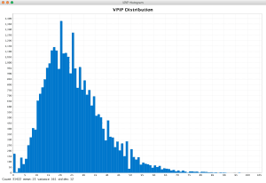
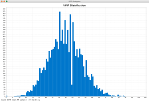
Histograms of VPIP Distribution
I’ve got a collection of 3 million poker hands, from a number of poker rooms, different types of games, different hero players, and different table sizes. I did some analysis of these hands to find out how VPIP is distributed.
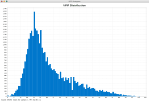
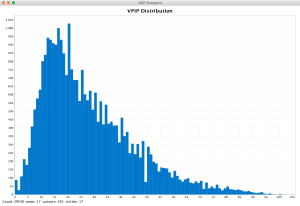
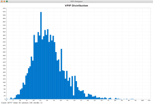
All these charts are histograms, with the x-axis showing all VPIP possible values from 0 to 100. They should how many people have a VPIP of 1, 2, 3, etc. VPIP is always rounded to the closest integer. I’ve filtered out players for whom I have less than 25 hands. In chart-speak, there are 101 buckets, ranging from 0 to 100.
You can see marked differences between tournaments and ring games, between 6-max and 9-max tables, and between No Limit Hold’em and Pot Limit Omaha. Spin’n’goes are really loose.
Click each chart to see a full-sized version.
No Limit Hold’em 6-max Ring Game
No Limit Hold’em 9-max Ring Game
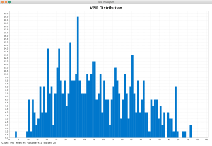
Pot Limit Omaha 6-max Ring Game
I don’t have a lot of data here; there seems to be no clear typical VPIP range here, but that would possibly change with more data.
No Limit Hold’em 6-max Tournaments
No Limit Hold’em 9-max Tournaments
No Limit Hold’em 3-max Tournaments
These are mostly PokerStars Spin’n’goes. Hyperturbo, short-stacked, three player – you’d expect a high VPIP here and the charts show that to be the case.
(Note: each chart shows a dip exactly at 50%; I think there’s some rounding problem somewhere in the process of making these charts.)
