Poker Copilot 5 Improved for Retina Displays
Have you tried Poker Copilot 5 yet? You can download it from our homepage.
If you have a Retina screen, such as what you find on a modern MacBook Pro, then you’ll notice that the text and icons on Poker Copilot 5 look much sharper than Poker Copilot 4. We’ve changed all the text to use a better typeface for Retina; we’ve created Retina versions of all our icons; we’ve made the necessary changes for the replayer and other screens to look as high-definition as possible.
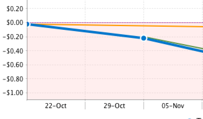
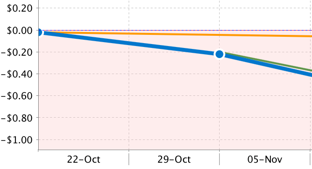
Today I realised there was one gap in our Retina improvements: the charts weren’t so good. I had never noticed before, but suddenly I couldn’t help but notice how blurry the text on the charts is compared to the text elsewhere in the app.
So I fixed it. Here’s a “before” shot and an “after” shot.
These improvements will be in the next update of Poker Copilot.

