Google Analytics Update: Almost a Good Graph
I like Google Analytics. I use it daily, and have done so for years. A week or so ago, Google Analytics received a nice user interface update. Graphs are better looking, and the site is easier to navigate. But one change disappoints me: line charts no longer start the y-axis at 0. Here’s a chart of Poker Copilot sales in recent weeks, produced by Google Analytics:
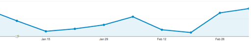
It looks like my sales last week were about 10 times higher than the week before. That’s not the case at all. This chart starts the y-axis at a value slightly lower than the smallest data point. I now find the chart misleading. My sales really don’t have so much variance from week to week. Poker Copilot is a mature product that has reasonably consistent sales.
There are cases where it is useful not to start the y-axis at 0. This is not one of them.