Updated HUD & Dashboard Layouts – Latest Revision
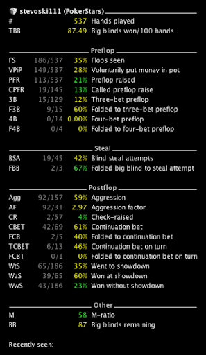
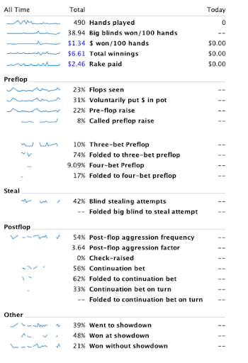
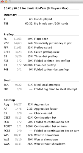
Posting screenshots of changes in recent days helped me discover some simple mistakes, such as some pre-flop stats in the post-flop section. I’ve fixed these, and now the layouts of the three screens concerned look as follows:
The HUD:

The advanced dashboard:

The “Get Info” window:

Hopefully the only thing that looks out of place now is my playing style indicated by the statistics…