Hipmunk: making online flight purchasing better
Fly often? Have you discovered hipmunk yet?
I have a side interest in data visualisation. So I’m always keen to see innovative ways to present hard-to-visualise data. Hipmunk has done soooo many things right – and much better than the big companies in their field.
Let’s start with the hipmunk search form:
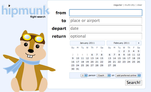
No need to manually select a “return” or “one-way” radio button or tab. Simply leave the return date empty for a one-way flight.
No need to click on a calendar pop-up icon – the calendar is always there, showing the current month and the next month – the two most likely months when you want to fly.
The defaults make sense – 1 person on coach on any airline is probably by far the most common search.
Click search and then hit the back button, and it actually works, bringing you back to the form the way you expect with web forms. Lots of similar sites manage to break the back button. Web users depend on the back button. Jakob Nielsen has long been telling us that “the Back button is the lifeline of the Web user and the second-most used navigation feature (after following hypertext links).”
Now the search results:
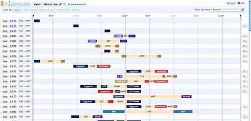
Wow! That’s what I thought when I first saw this. Finally, a way to quickly assess the options. The beige colour represents stop-overs. Each airline gets its own colour so I can see, for example, that for $541 I can fly with Egyptair to Dubia (DXB), wait for about two hours, then continue with Emirates.
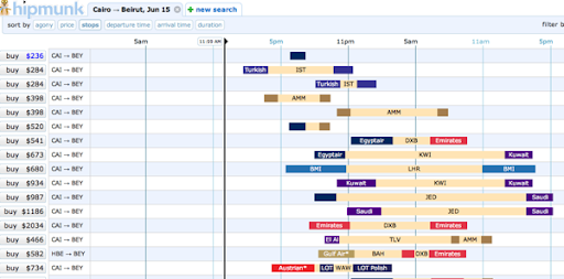
I don’t handle mornings well. Nor do I like stop-overs. So can I see this data prioritising direct flights that leave in the afternoon? You betcha – all the browser side, with no server refresh:
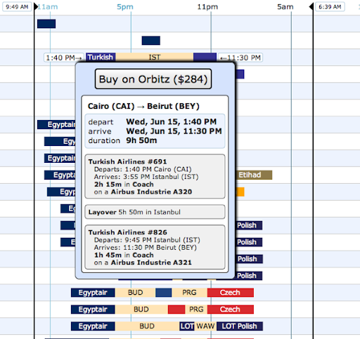
And it is all so easy. Click on any flight to see the details:
There’s a principle in web application user-interface design: if the end result seems far too simple for the amount of work you have put into it, then you have succeeded. Simple user interfaces are hard. Complicated user interfaces are simple. Hipmunk succeeded.