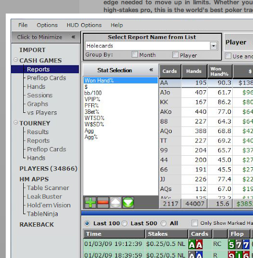
Hold’em Manager Inspired by Poker Copilot UI?
I’m surprised this didn’t catch my attention early. Hold’em Manager abandoned the cluttered tab-within-tabs nightmare that plagues poker tracking software. Instead they now have something similar to Poker Copilot’s “Source List”, or side-menu. Of course Poker Copilot borrowed the idea from Finder and iTunes.

I find myself wondering if the Hold’em Manager team were inspired at all by Poker Copilot’s appearance. If so, then I don’t feel so bad about using Hold’em Manager as a reference point for some Poker Copilot features and formulas.
For those who don’t know Hold’em Manager, they are one of Poker Copilot’s competitors. Whereas Poker Copilot is poker tracking and analysis software for Mac OS X, Hold’em Manager is for Windows. They have no Mac OS X version.