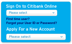
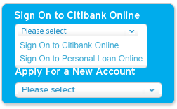
From the "I found a _cool_ JavaScript trick and I’m gonna use it" Department
Hey Citibank Australia website designers/developers:
A drop-down list is a poor choice of user interface control when there are only two options.

 HTML has a spectacularly simple and useful feature you could use instead of a home-baked drop-down list. It’s called a hyperlink.