Do Big Shiny Download Buttons Work?
A couple of days ago I uploaded a new version of the Poker Copilot home page. The new version has a enormous, bright, in-your-face download button that you can’t ignore if you try.
 I’ve heard that this completely unsubtle approach maximises downloads. The idea is that when people look for a product – let’s say a poker hand history analysis tool for Mac OS X – you should make it as easy and tempting as possible to get the product on their computers. Did it work for me?
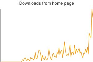
Let’s take a look at a chart:
The spike at the end of the graph says it all. Spike is not even an adequate word here. It’s a kangaroo leap to a new level.
I’ve not yet determined if there were side-effects, such as a drop in downloads from the download page or an increase in sales.