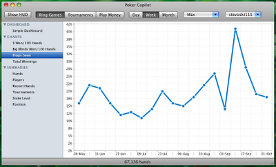
New Poker Copilot User Interface
When adding new screens to Poker Copilot, I found the “Tab per screen” approach was becoming cumbersome. Poker Copilot was heading towards a dread category of software: “software with a user interface that looks like it was designed by a techie”. This is definitely a category I do not want Poker Copilot in.
Therefore I shut down my Java IDE, read some articles on software user interface design, and reflected on what to do. I chose to adopt the user interface used by Mac OS X’s Finder, iTunes, and Apple’s Mail. This allows me to add many more screens. These screens can be grouped and selectively revealed while leaving plenty of screen real estate for showing graphs and tables. This is the result:

The next update of Poker Copilot will have this new user interface.